Beeminder

Beeminder Reimagined


8th April 2016

Hello Beeminder,


My goal for the proposed redesign is to help people who are new to the concept of self quantification and commitment tracking.

This proposal is only meant to be a starting point. I do not know what your goals and problem cases are. The idea is to build a brief for the project based on your reactions to this presentation.

The problem case driving this proposal is that I cannot share Beeminder with my friends. They either do not understand what it does or they are too intimidated to use it.

My point of view is biased. To make a stronger case I ran three twenty-minute usability tests to set a baseline for the project. I used TryMyUI.com for as unbiased an opinion as possible, given the time frame.

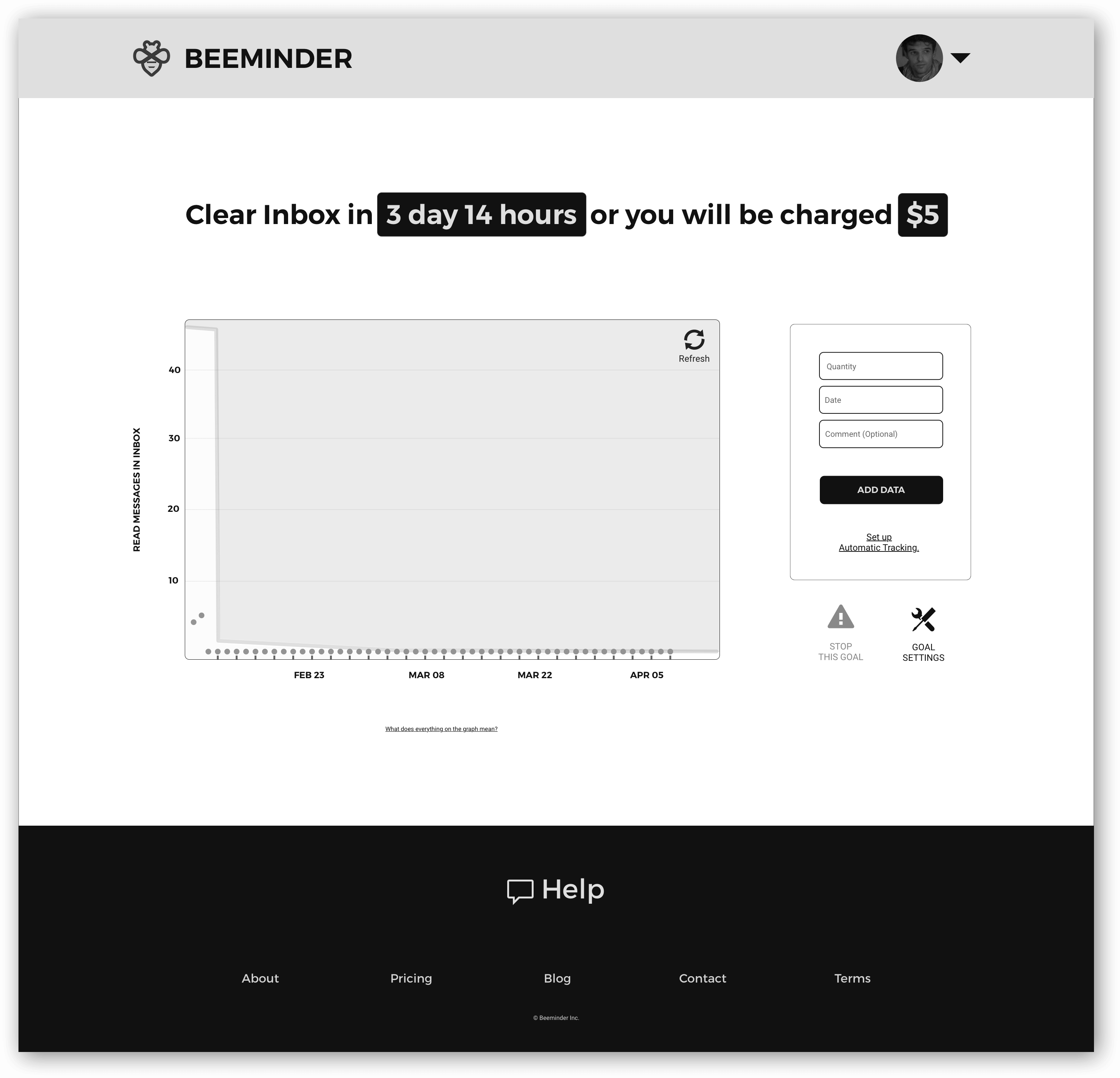
Each participant had three tasks:


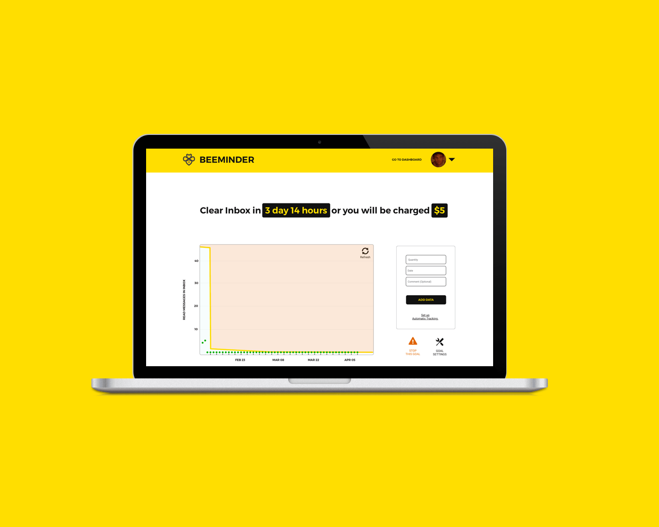
  • Task 1: Sign up and commit to clearing out your Gmail inbox at least 4 days a week.
  • Task 2: Sign up and commit to walking 10,000 steps at least 5 days a week.
  • Task 3: Change your inbox commitment to 5 days a week.

None of the participants were able to complete all three tasks in 20 minutes.

Instead of just failing to accomplish the tasks, one participant silently failed. She believed she connected her Gmail account when she had not.

Screen recordings of all three testing sessions are available here. I have also included tester profiles and an executive summary.

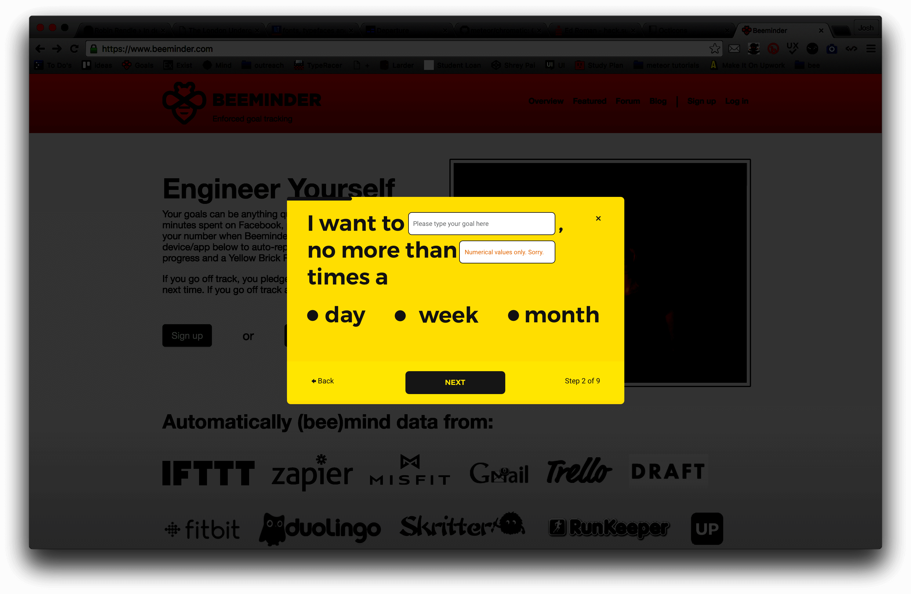
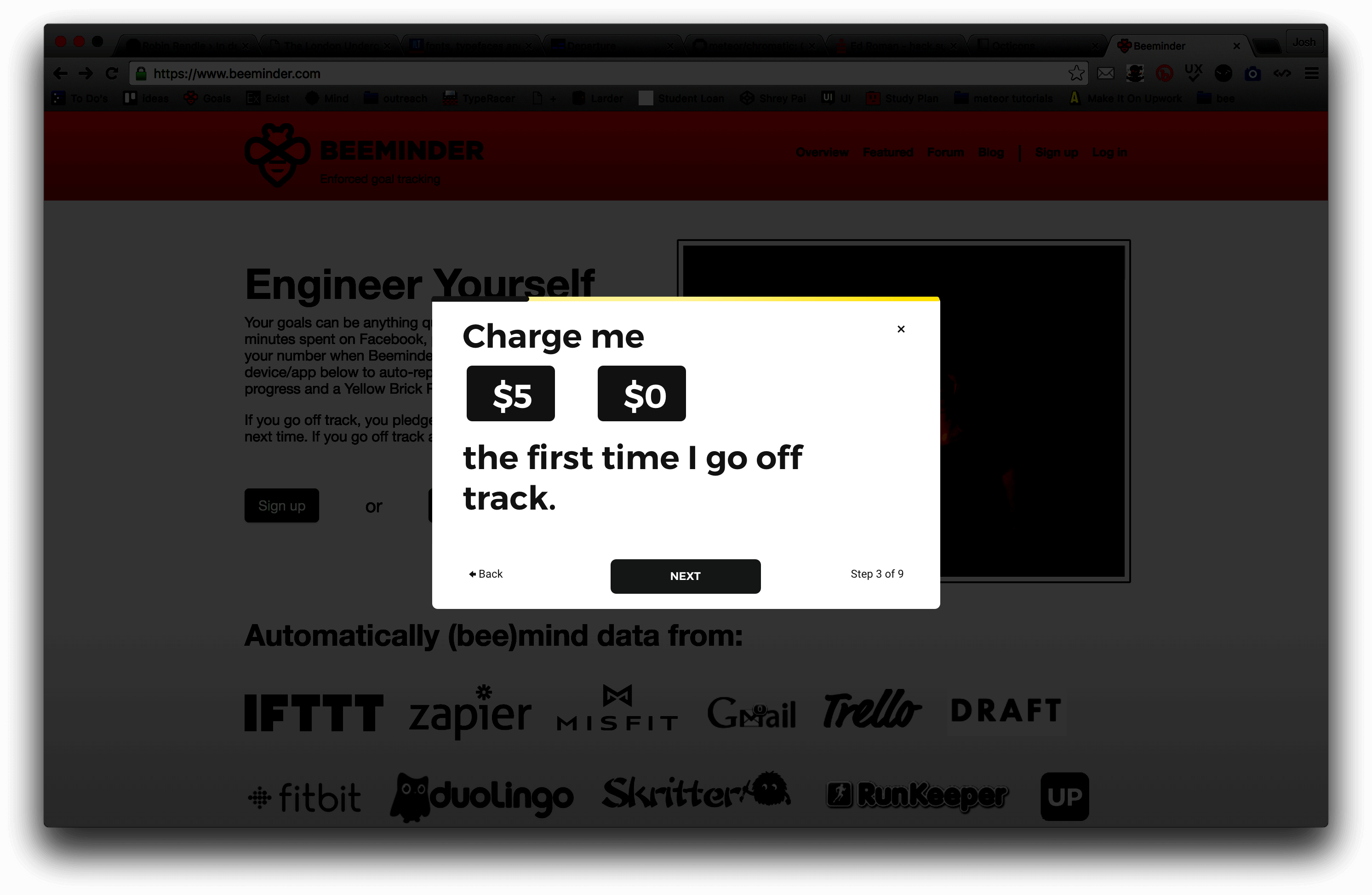
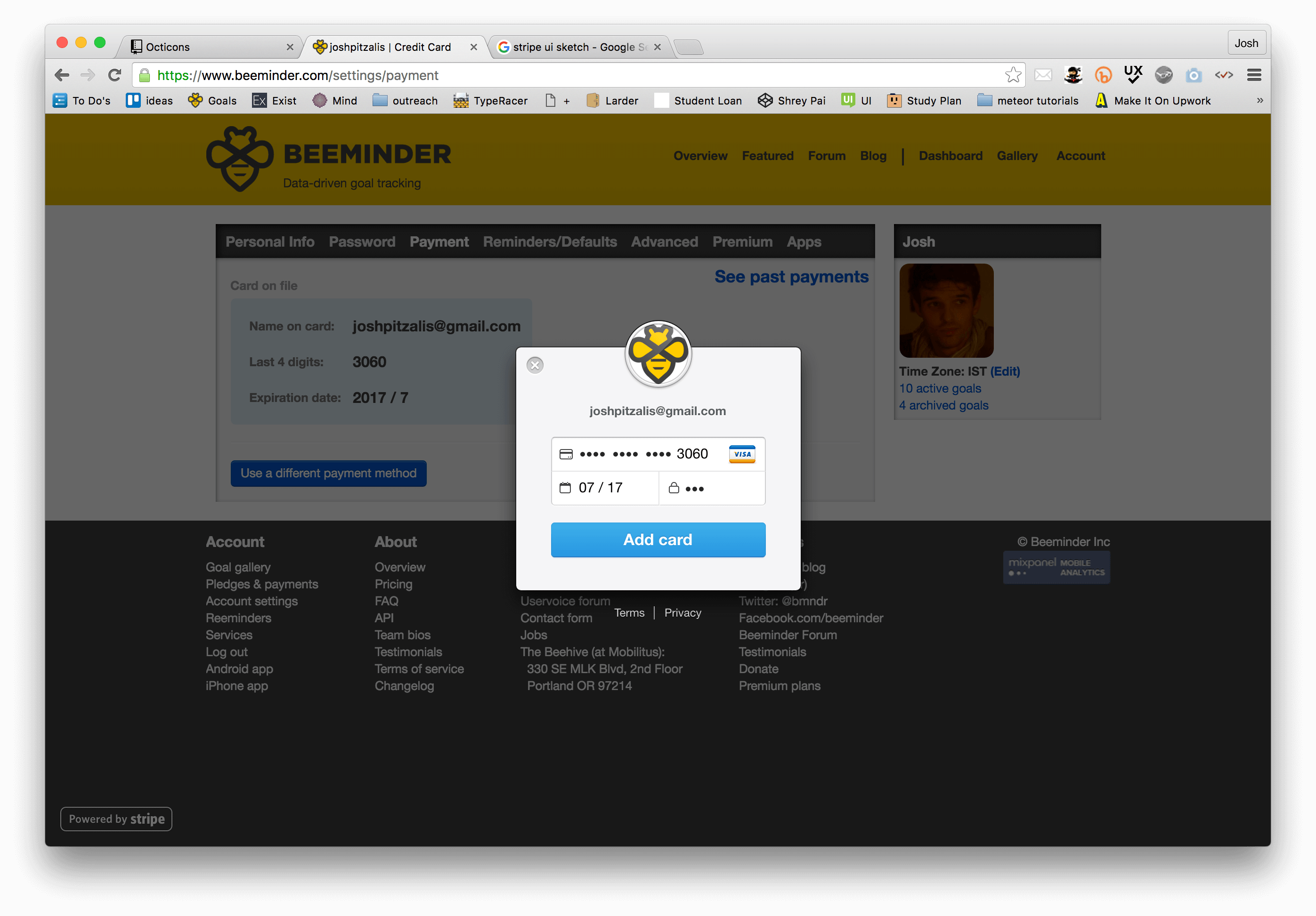
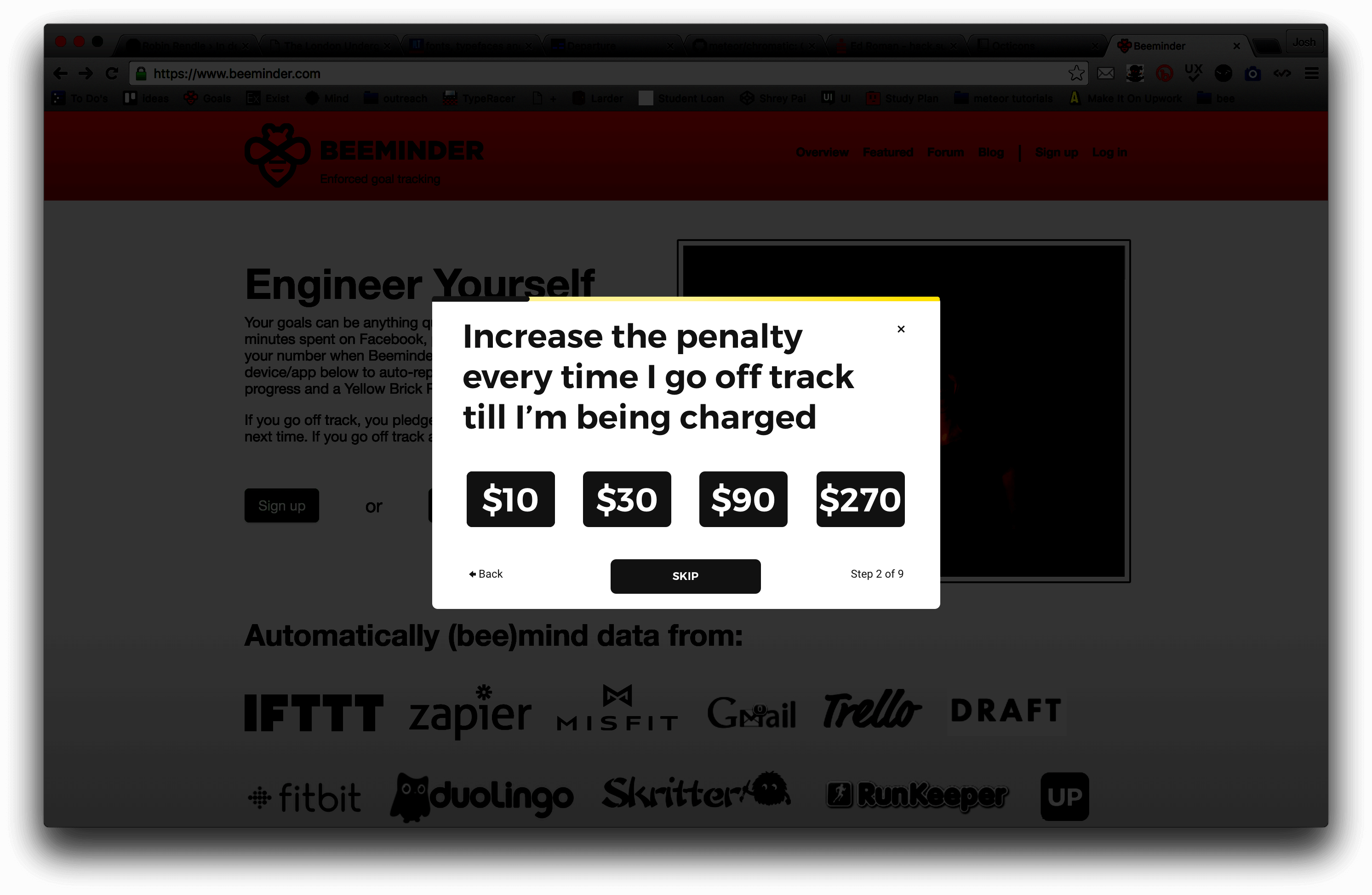
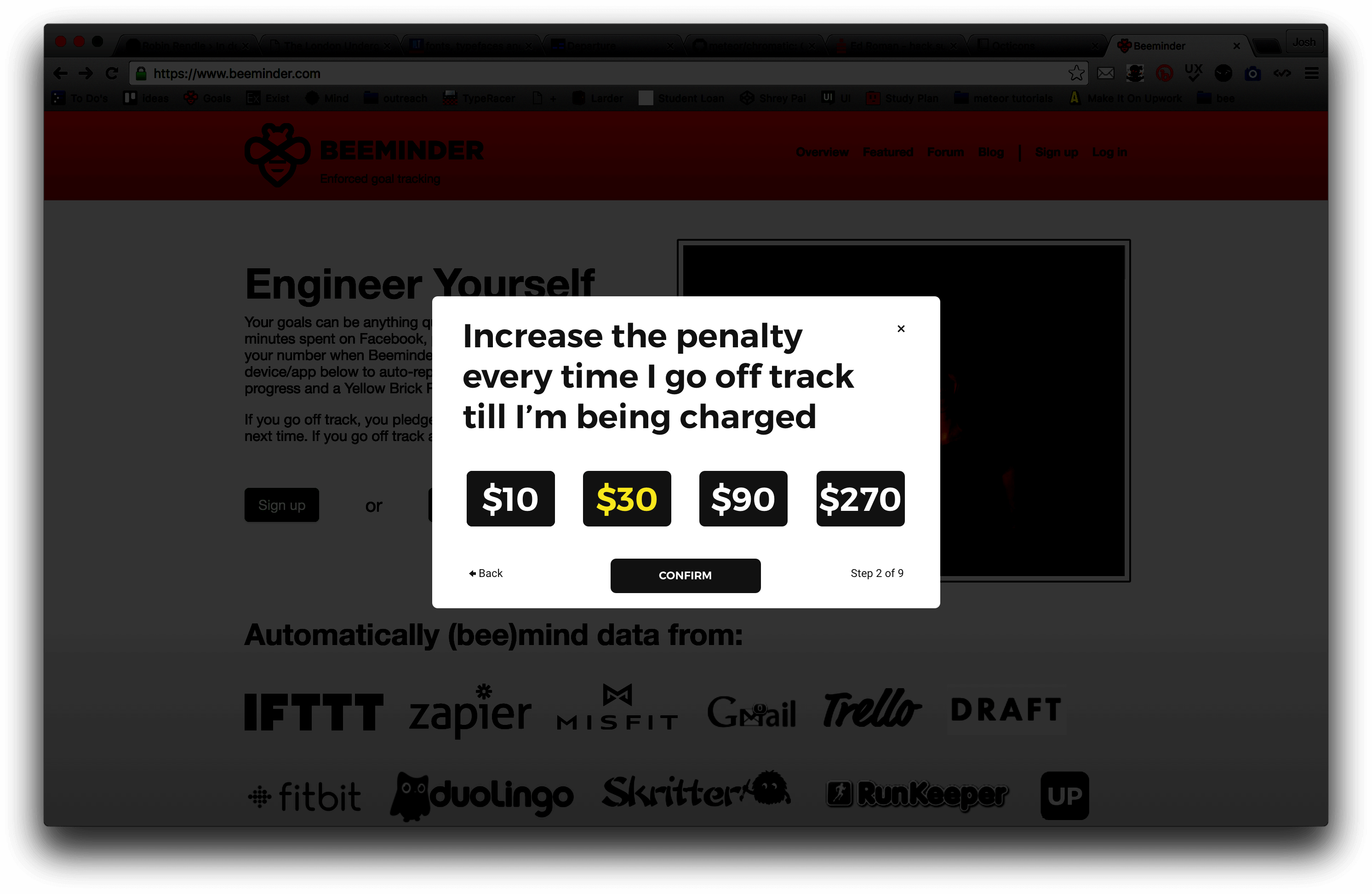
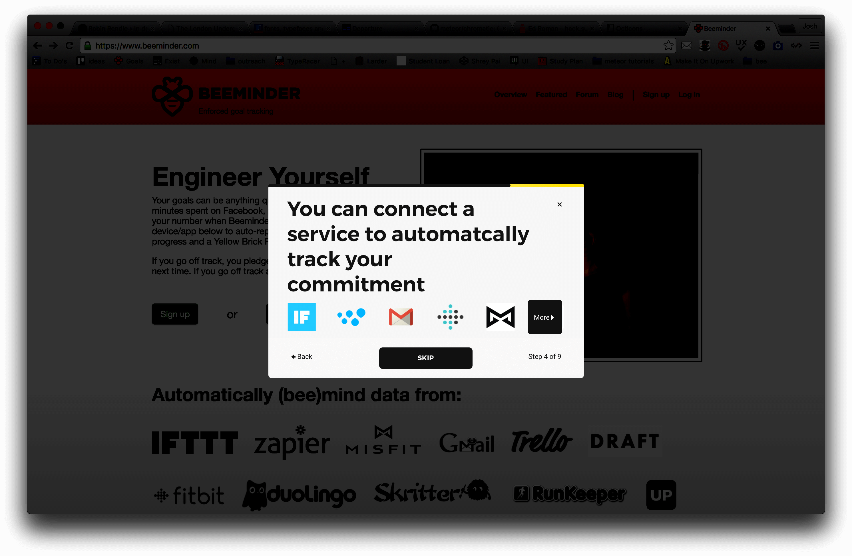
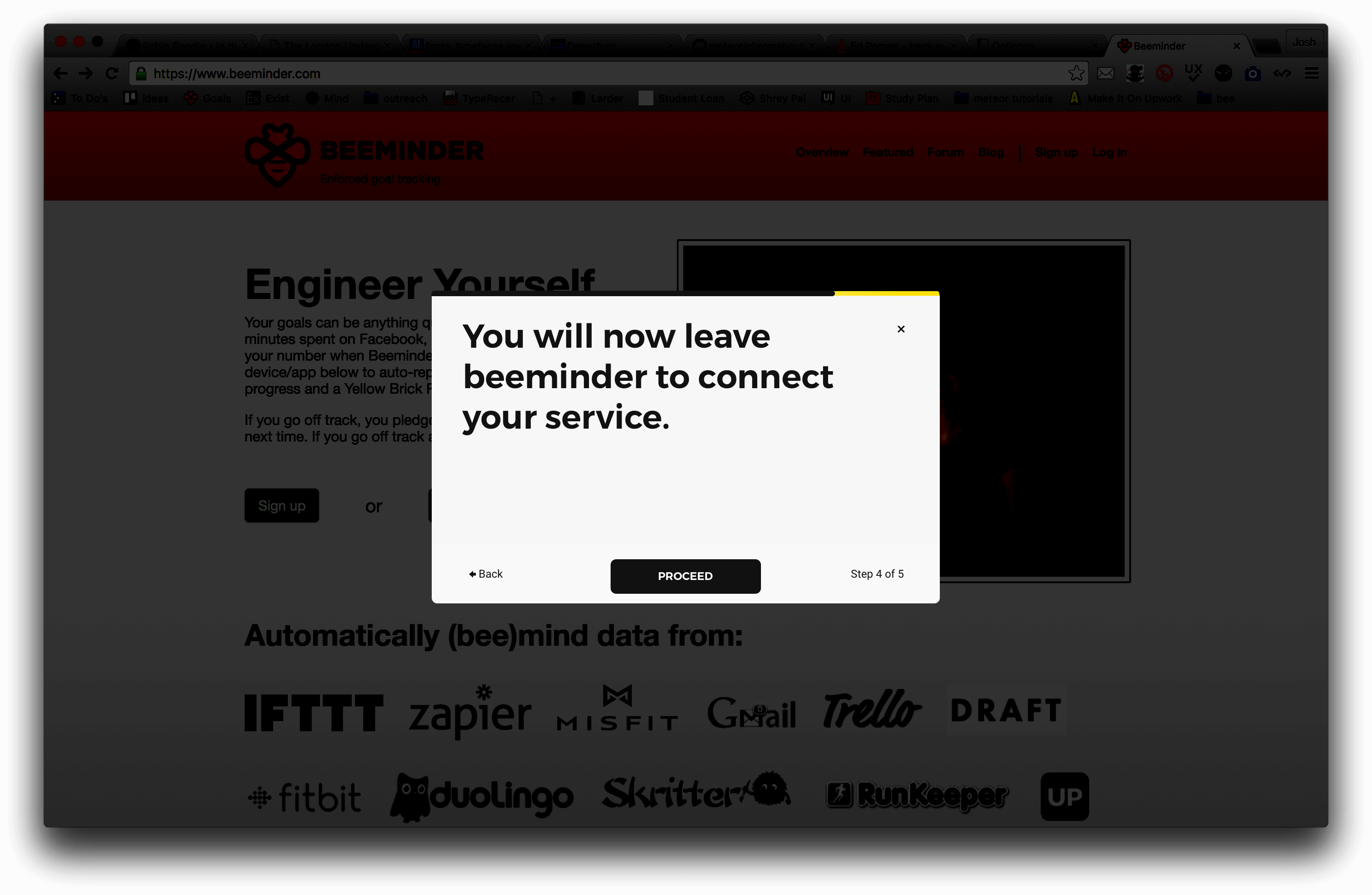
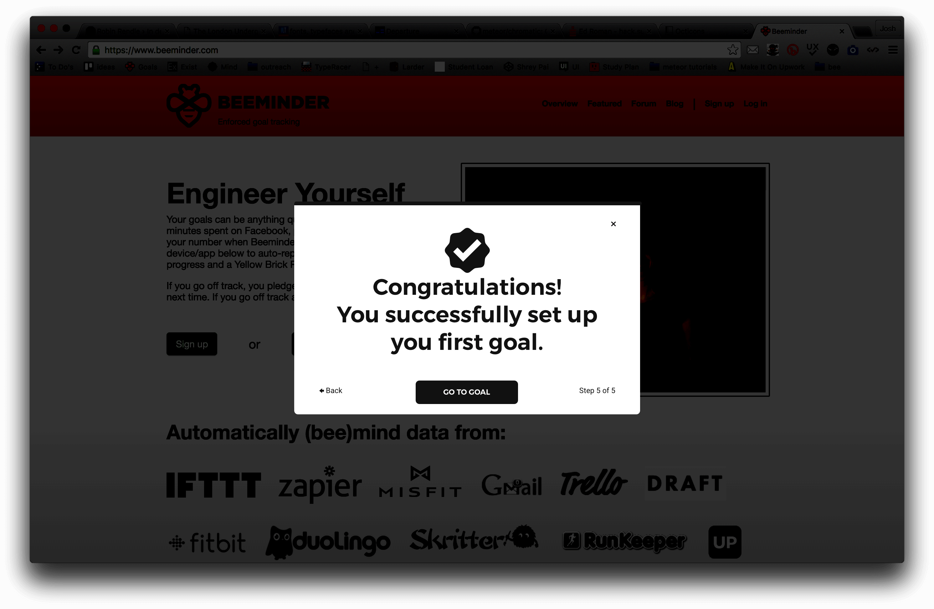
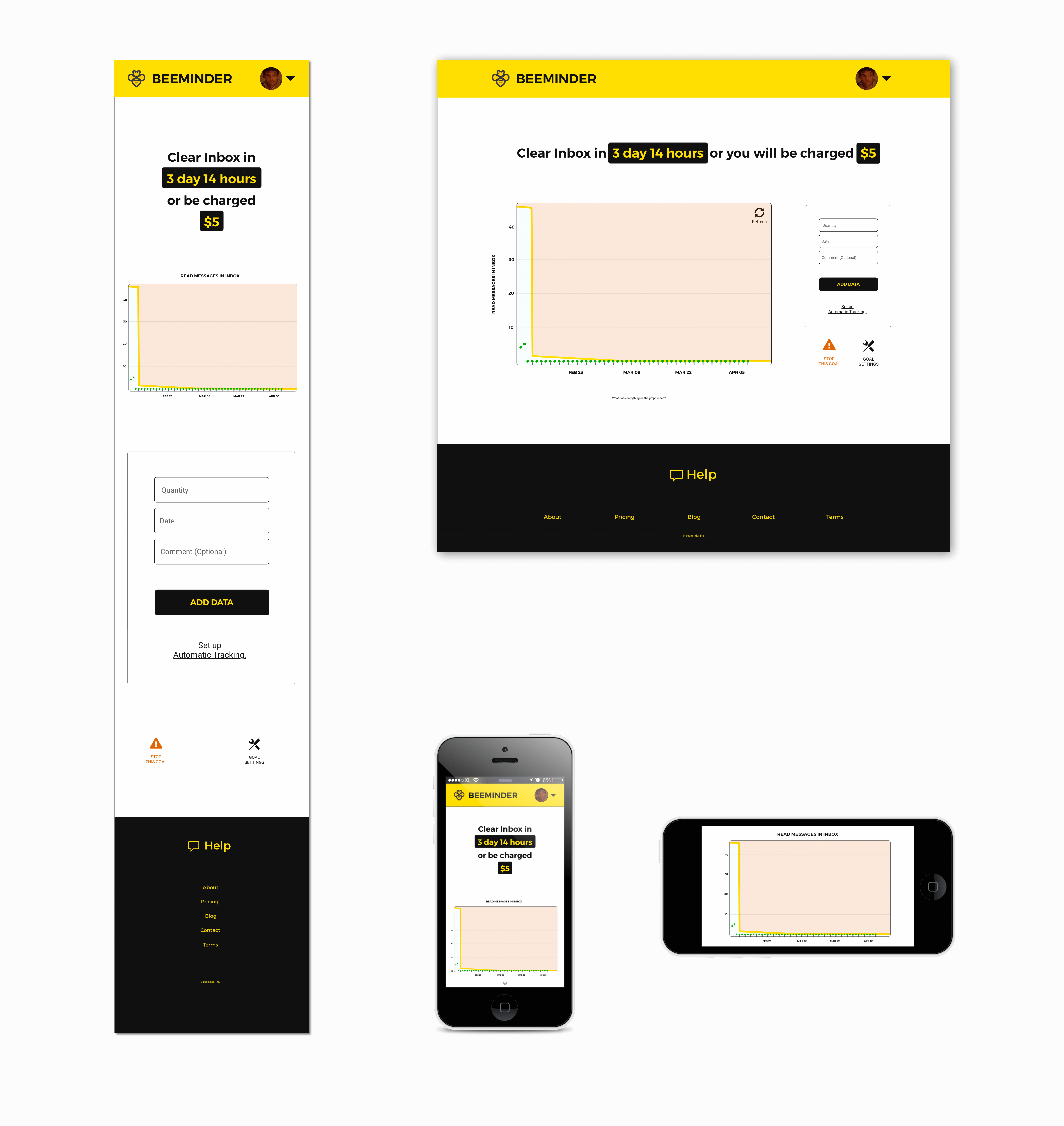
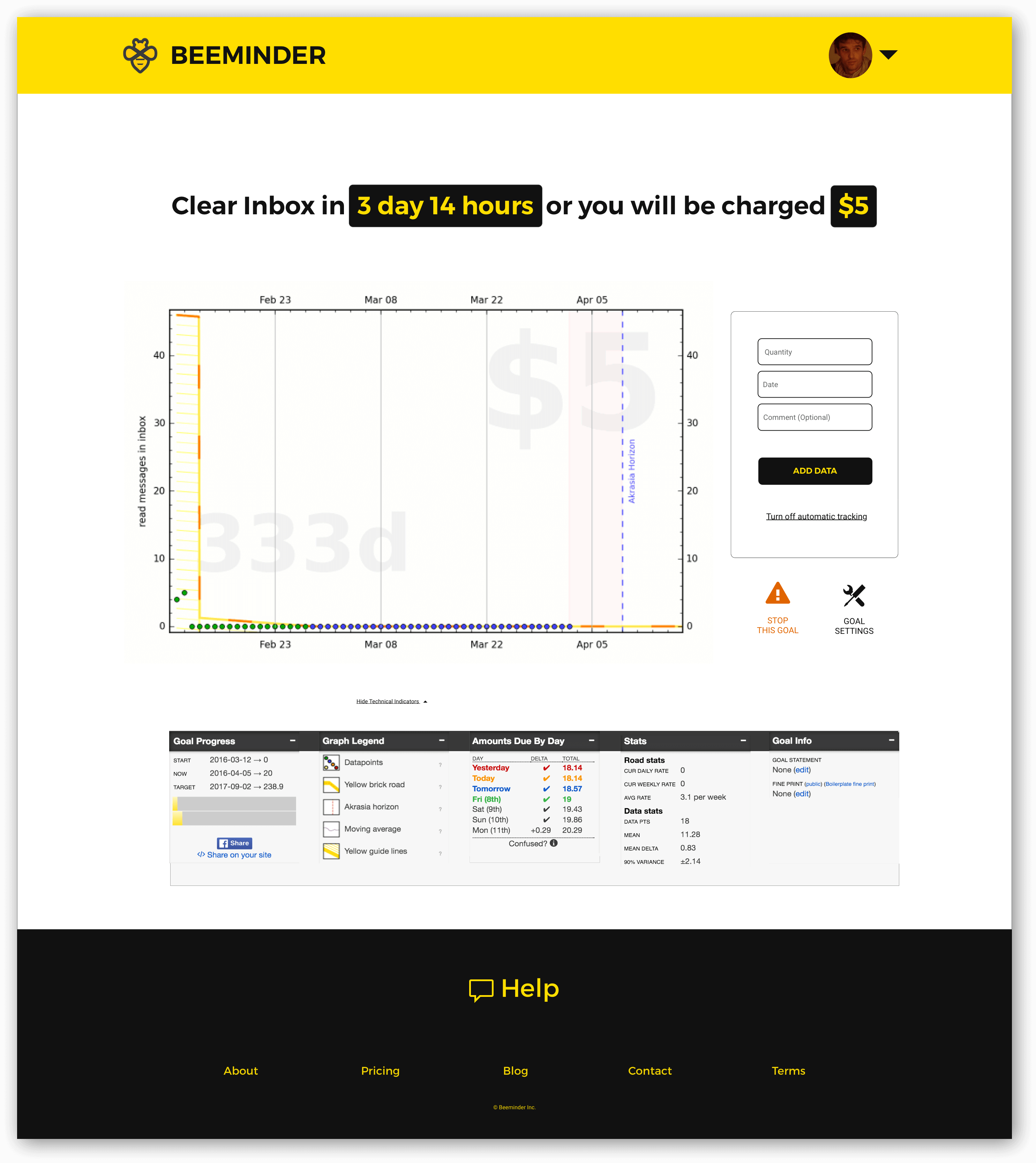
I have focused on a single user journey in this proposal: Being able to sign up and commit money to a goal.

COMMITTING MONEY TO A GOAL


This is a flowchart of the current user journey to sign up and commit to a goal.


Testing revealed that the biggest barrier in this user journey is the fork at step 3.

I suggest reducing options until users understand the conventions of the interface.

You could also avoid potential errors by providing status indicators, an undo button and feedback about the progress on each step.

I also added a 'thank you' to confirm completion.


The final screens for each of these steps are in the design proposal after the next section. The next section will explain the thinking behind the changes I am proposing first.


THE GOAL PAGE

Signing up and committing to a goal leaves users with the current goal page.


I tried to group related items together so that it is easier to understand the following:

  • What is happening,
  • What will happen,
  • When it will happen and,
  • What they need to do to prevent it from happening.

This layout also allows better access to keyboard-only users and people with vision impairments.


  1. Navigation: Clicking on the logo takes you home. The dashboard button button takes you to the dashboard. Everything else is inside the settings button. The look of the 'Dashboard' button is consistent with every button in the sign up process. The dashboard becomes the first place you navigate back to when you get lost. I have also used circular profile pictures. Less background area means more focus on the face. A square profile picture displays more background area than a circular one.
  2. Progress Bar: The product works best when connected to a credit card. What people need to do to not be charged should be obvious. I have not spent much time on the wording, I'm sure it will change, I was just trying to make a point.
  3. Deadlines: Retro-ratcheting and deadlines can be changed by clicking on the countdown button.
  4. Penalty Adjuster : Clicking on the amount button allows you to adjust your pledge.
  5. Refresh: Placing the refresh button beside the graph makes it easier for people to view the latest data when they tab through the page.
  6. Add Data: If data is not tracked automatically, adding data becomes one of the primary reasons to use this page. Adding data from the goal page, as well as 'quick add' on the dashboard, minimises the time people need to spend looking for a way to add data to the goal.
  7. Automatic Tracking: If a service is connected during setup then this changes to 'Turn off automatic tracking'.
  8. Stop: Pausing and archiving goals can be done through a single 'stop this goal' button. This provides a single point of focus for any kind of interruption.
  9. General settings: All other page settings can be accessed through the settings button. I've provided icon labels and tried to use natural language where possible. Having fun names for things is much better than dry text but not at the expense of understanding.
  10. Technical indicators: Labelling additional indicators 'technical' means that people who want additional information will be drawn to it and people who are intimidated by the system will stay away from it.


  11. Help: When usability testing the site I added a fourth task:

    • I asked them to cancel both commitments and deactivate their account.

    This task cannot be completed. There is currently no way for someone to deactivate their account. The reason I added this is to see how long it would take someone to use your extensive FAQ and excellent support system.

    The results suggest that because there are too many links in the footer users fail to associate the footer with a relevant purpose.

    Prioritising the footer for one purpose means that people know they can refer to the footer when they have a problem. The other links have been collapsed into more conventional link names that people are used to seeing in footers. Sticking to conventions where possible reduces the time it takes for people to find what they are looking for.

    Again, screen recordings of all three testing sessions are available here..

DESIGN PROPOSAL


USING THE CURRENT GRAPHS

Things that do a good job of solving complex problems are usually complicated.

Your graph's complexity is key because it communicates a huge amount of useful information.

Sacrificing features for white space makes no sense when each feature solves a use case that someone cares about.

I made sure that the redesign works with the existing graphs.


If you want clearer graphs then I can put a lot more time into thinking about it. I would need to know how they are built, so that I don't propose a solution that is a nightmare to build.

My only suggestion at this point would be to match the typeface to the new interface.

Casually testing the interface, I found friends were sometimes way ahead of their goal but thought they were off track because they were not on the yellow brick road. Adding a light green and red highlight to the backgrounds on either side of the yellow line would help make the graph easier to understand.


TWO TYPEFACES

The display font is Trueno Semi Bold. I wanted to select a typeface that was indistinguishable from you current logo typeface. Of all the options I shortlisted, Trueno letterforms had the most space inside the letters. Wide apertures and the large counterforms make a text more readable.

I chose Roboto Regular as a body font because I needed a typeface that matched the display font and was also legible at small sizes and in large blocks of text.


COLOURS

Roughly 5% of the population are colour blind and over 60% do not have 20/20 vision. For this reason I have picked the highest contrast yellow and black combination I could find.

For the most part, colour is associated with specific actions: error states, primary and secondary button press responses and controls.

I've used slight hints of orange and green for success and danger notifiers but otherwise I have stuck to a monochromatic colour palette. This means you never rely on colour for the site to make sense.


DELIVERABLES, COSTS AND TIME FRAME

I have not tested the proposed interface because I assume the final product will not look anything like what I just proposed.

I only wanted to show you that there are usability problems, and I wanted to demonstrate how I would address them.

For me to begin work, I need to understand what you want from the redesign, what your concerns are, what your current users' concerns are, what kinds of design boundaries there are and the limitations to handling them.

To make sure we were building the thing right I would love to involve the incredible community you have built. Testing new design on a small group of existing users, and new users, to get the most relevant feedback possible.

If you like my approach and would like me to continue working on the project, I estimate that it will take 8 weeks to redesign your interface.

If you only want me to work on flowcharts and wireframes then it will take 5 weeks.

Pricing structure:


DELIVERABLE COST
Flowcharts and Wireframes $1250
UI Design $1250
Logo and custom design components $1250
Total $3750

Logo and custom design components would include a new graphical language used across the site to indicate different types of content (symbols), actions and controls (icons), achievement and warning symbols (badges) and a collection of default user icons.

Adding this option will not take any longer because these will be designed in parallel with the UI. I would have to collaborate with a design agency for the logo design section.

If this interests you, I can put together another proposal just for the logo and custom design components. It will cost the same as this proposal, it will take 2 weeks to deliver and the cost of the proposal will be deducted from the project if you decide to move forward with the design work.

NEXT STEPS


Please take as long as you need to think through this.

If you would like to move forward I suggest we get on a Skype call. I am currently in India (+5:30 GMT). Some time between 8 - 12 in the morning your time would be ideal for me.

If anything was unclear, please email me and I will respond as soon as possible.

I hope you enjoyed the proposal and thank you for giving me the opportunity to work on this.


Joshua Pittman Pitzalis

UI Designer

joshpitzalis@gmail.com